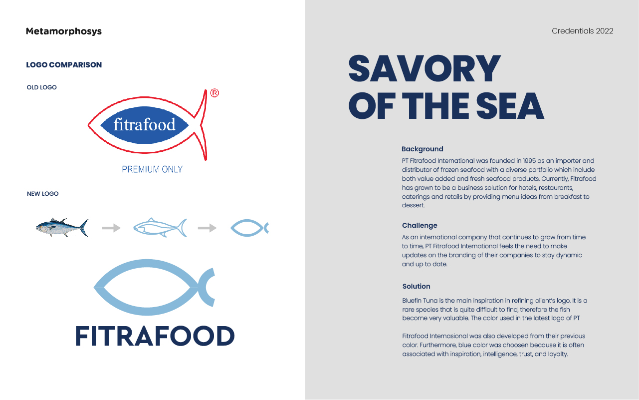
Background :
PT Fitrafood International was founded in 1995 as an importer and distributor of frozen seafood with a diverse portfolio which include both value added and fresh seafood products. Currently, Fitrafood has grown to be a business solution for hotels, restaurants, caterings and retails by providing menu ideas from breakfast to dessert.
Challenge :
As an international company that continues to grow from time to time, PT Fitrafood International feels the need to make updates on the branding of their companies to stay dynamic and up to date.
Solution :
Bluefin Tuna is the main inspiration in refining client’s logo. It is a rare species that is quite dicult to find, therefore the fish become very valuable. The color used in the latest logo of PT Fitrafood Internasional was also developed from their previous color. Furthermore, blue color was choosen because it is often associated with inspiration, intelligence, trust, and loyalty.